Ladislav Sutnar
Ladislav Sutnar, a Bohemian painter and an advertising, display, and industrial designer, was an innovator in the field of information design and information graphics. Sutnar was known for his ability to communicate complex information with clarity, most notably for Sweet’s Catalog Service and in publications including Design for Point of Sale (1952), Package Design: The Force of Visual Selling (1953), and Visual Design in Action: Principles, Purposes (1961). His graphic design vocabulary, based on Constructivism and geometry, employed functional typography, limited color palettes, and layout frameworks to facilitate searching, scanning, and reading. Sutnar was also one of the most notable industrial and... more.


")

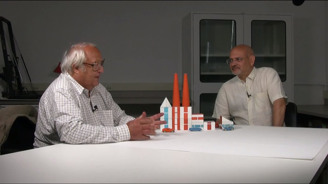

Sutnar on Sutnar
Steven Heller and Radislav Sutnar discuss aspects of the life and work of 20th century designer Ladislav Sutnar, featuring objects from the collection of Smithsonian's Cooper-Hewitt National...